Website Design and Strategy
Objective
3M Communications Division was looking to migrate their web experience to a new, responsive platform. Instead of a simple 1:1 content migration, my team decided to take this project as an opportunity to improve the end-user experience.
Process
1. Gather and analyze historical web metric data for the current site
Key takeaway: we are missing opportunities to message to our users or introduce them to the breadth and scope of our greater portfolio
- Dominated by organic search
- Site behavior is product task oriented
- Search is product number heavy which, could speak to low brand resonance
Key takeaway: users weren't easily able to find what they were looking for
- High search activity and majority of users are jumping straight to search for general product navigation
- High bounce rate
Conclusion: we are distracting users with extraneous information and there is a general mismatch between intended design, what the user wants, and what is happening on the site
2. Develop a prototype for a structure and labeling for optimized navigation and validate it
Research question: What is the most appropriate structure for the Communications web experience including labeling/categorization and how each category relates to one another?
Hypothesis: the current market-level categories included on the old site overlapped contributing to self-selection confusion and didn't provide a clear pathway for users to accomplish key tasks
Test: design a usability test for the high-level and sub-category labels for each segment by assigning participants tasks to see if they are able to navigate the proposed structure and easily find the content they are looking for
Findings: 85% of participants selected a 4 or higher (on a scale of 1-5, 1 being strongly disagree and 5 strongly agree) when asked if they would easily be able to find what they are looking for on 3m.com using these new categories
3. Gather additional quantitative data around content needs
Methodology: survey
Findings:
- Clearer pathways to market categories and sub-categories through the use of applications
- Provide more explicit descriptions for headings
- "Contact Us" should be easier to find
- Allow users easier access to relevant how-to and training content
4. Architect and implement a new experience based on the insights gathered
Design
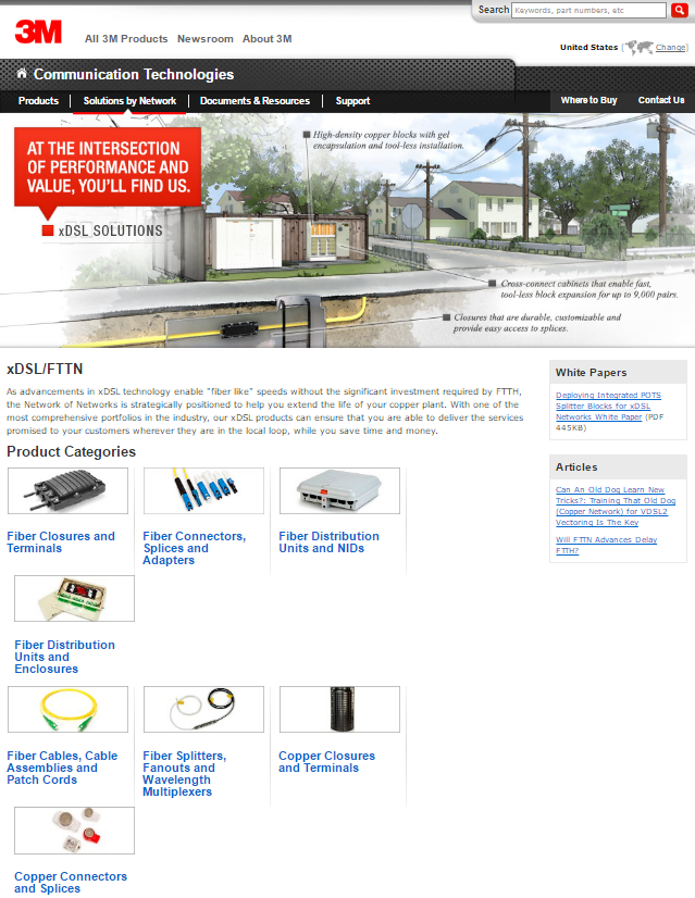
Before
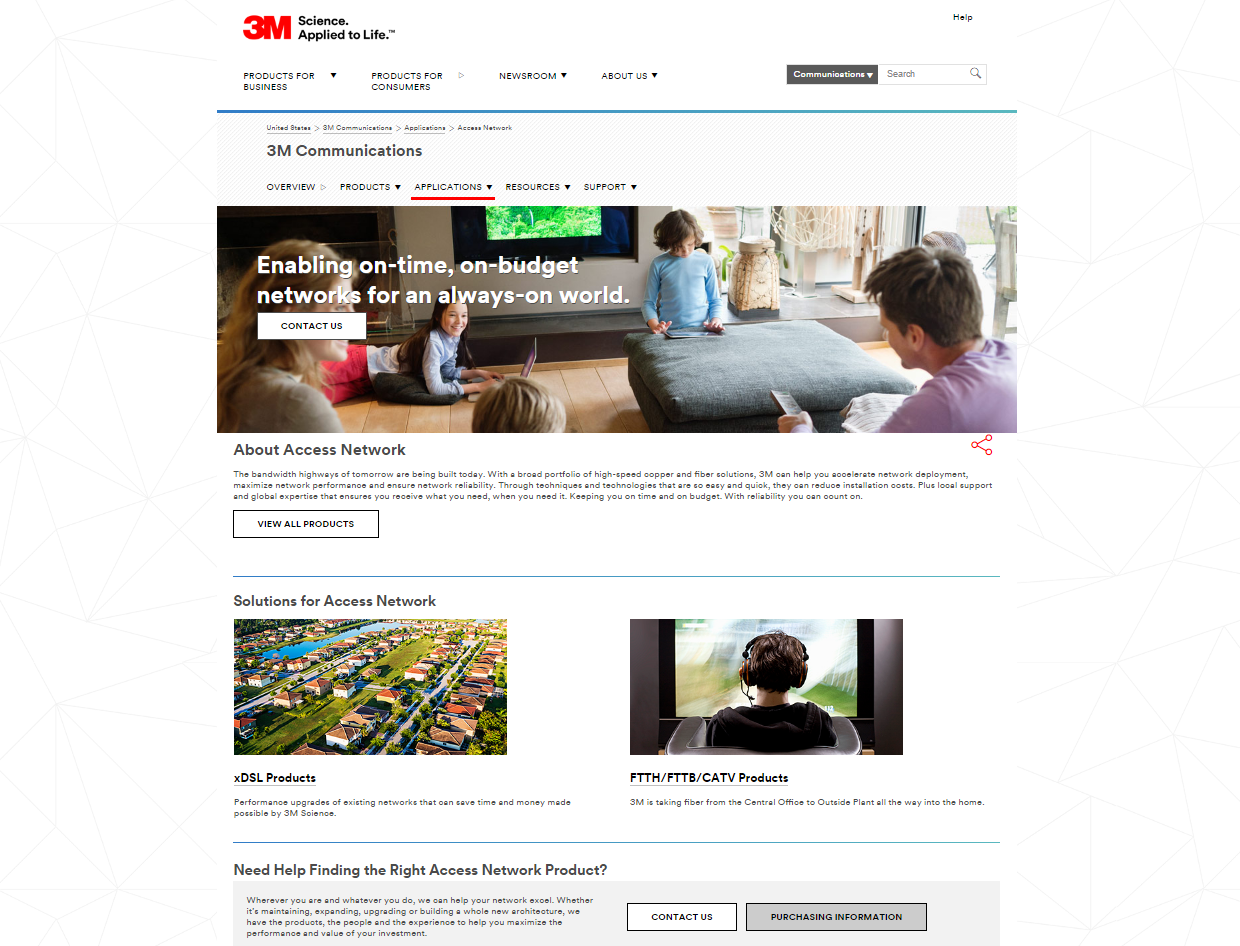
After
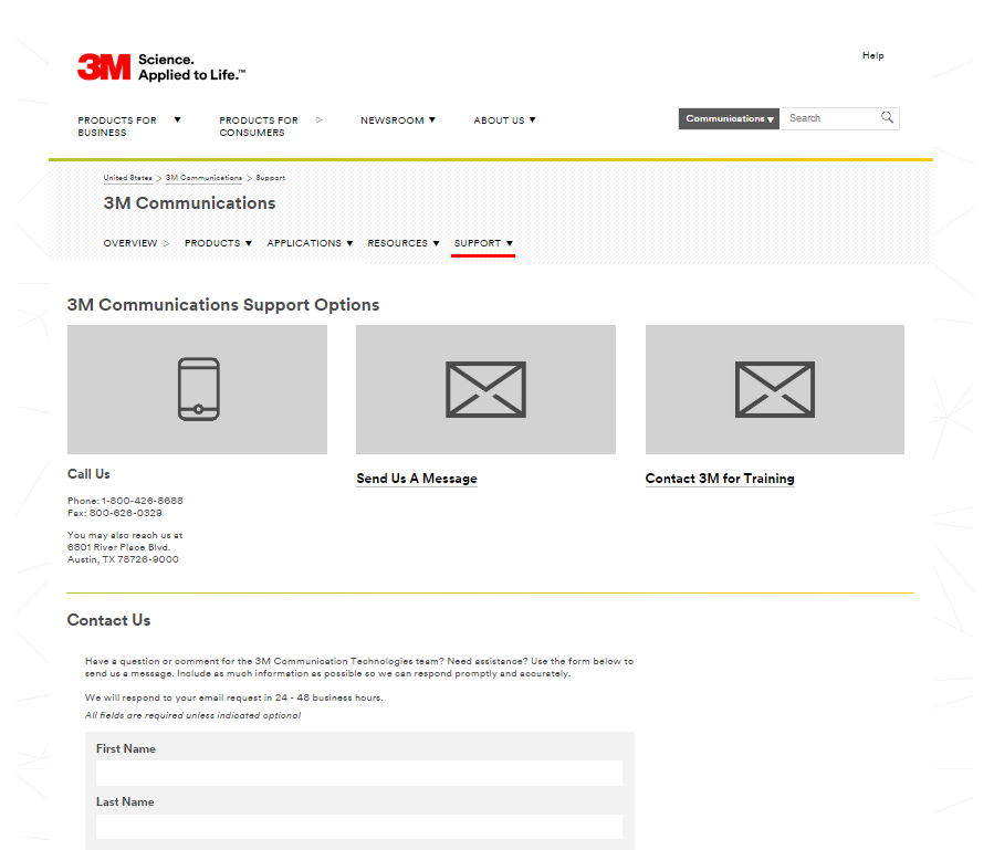
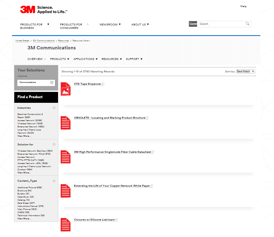
The redesigned site features a clear structure that was more categorically intuitive and utilized language that better resonated with users. The new site also aimed to provide users with a clearer path to key actions making the experience more visually navigable.
The original site eagerly jumped to product information without taking the opportunity to ensure customers that 3M understood their markets at a higher level. The original design also muddled the pertinent content with a myriad of CTAs that made it difficult for the user to easily find information.
Additional Design Features
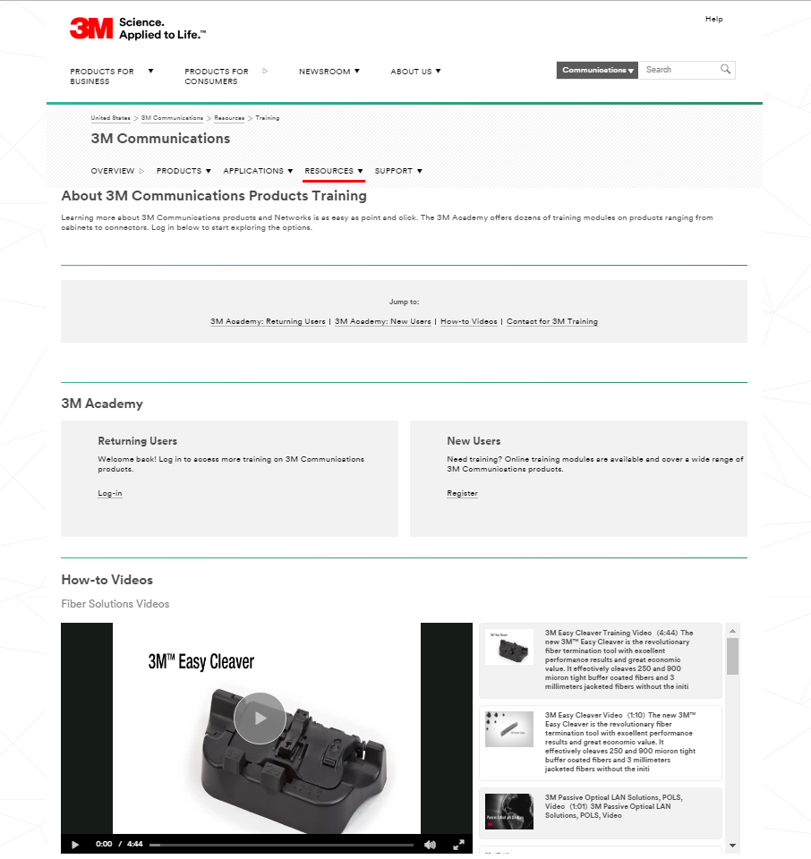
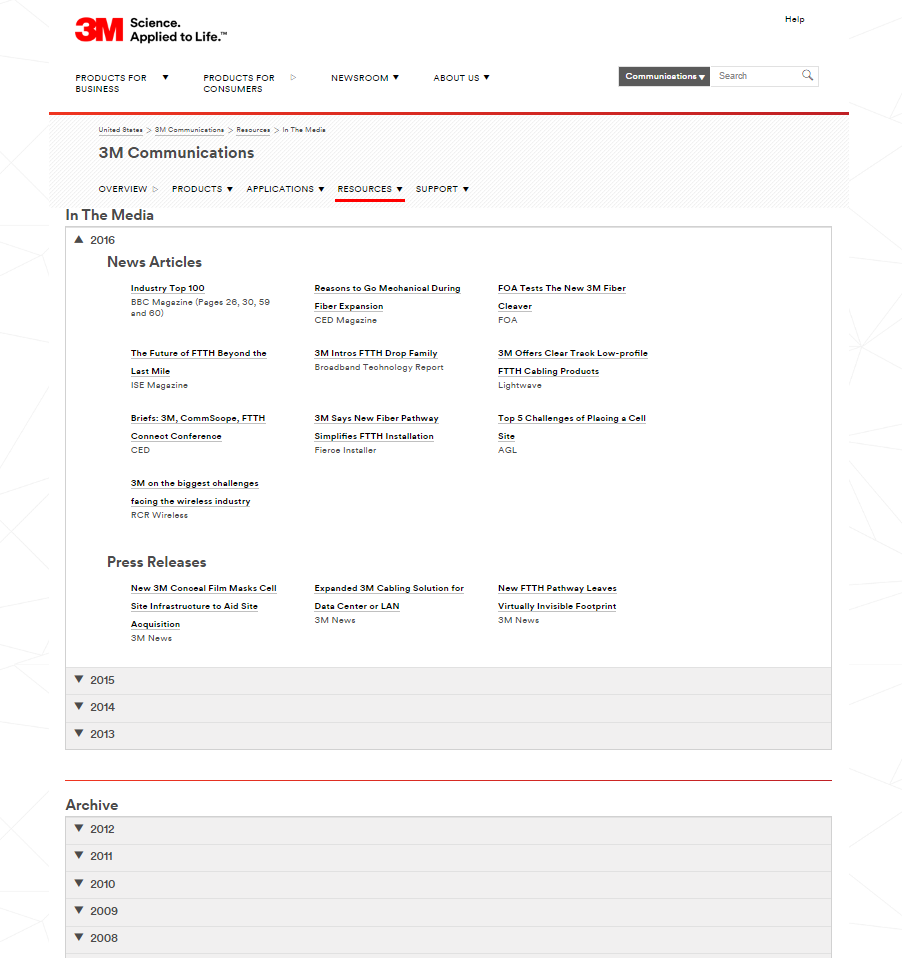
The introduction of a new navigational structure also gave us the ability to disperse content throughout the site in a way that made sense for the user. For example, instead of having links to whitepapers and news articles living on the homepage along with all of the product content we established a more intentional home for resource and support tasks we knew users were coming to the site to accomplish.
Outcome
The goal of this redesign was about making the user’s experience the best it can be. We want to make sure we are leading people down the appropriate path based on the tasks they come to our site to accomplish. From the overview page to the product catalog, we want to make their journey as easy and intuitive as possible. The evolution of this experience, however, will not culminate with this project. As our user's needs change so will the objectives of the site...it will continue to live and breath in a continuous, parallel path.

